CHALLENGE
Pink & Scale is a fictional, Vancouver-based brewery. In this student project, I gave them a brand identity, logo, and packaging.


STRATEGY
Pink & Scale is a fictional cooperative brewery based in Vancouver. They will receive a complete brand identity and packaging to establish its presence as a business.
The visuals and communications will emphasize that the brewery is locally inspired and owned, and all the beverages are locally produced.
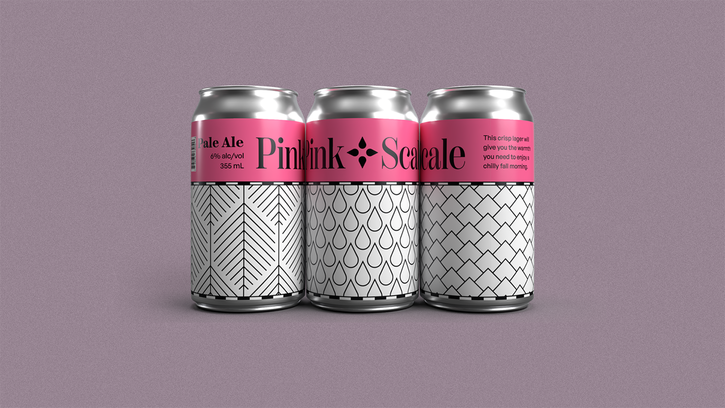
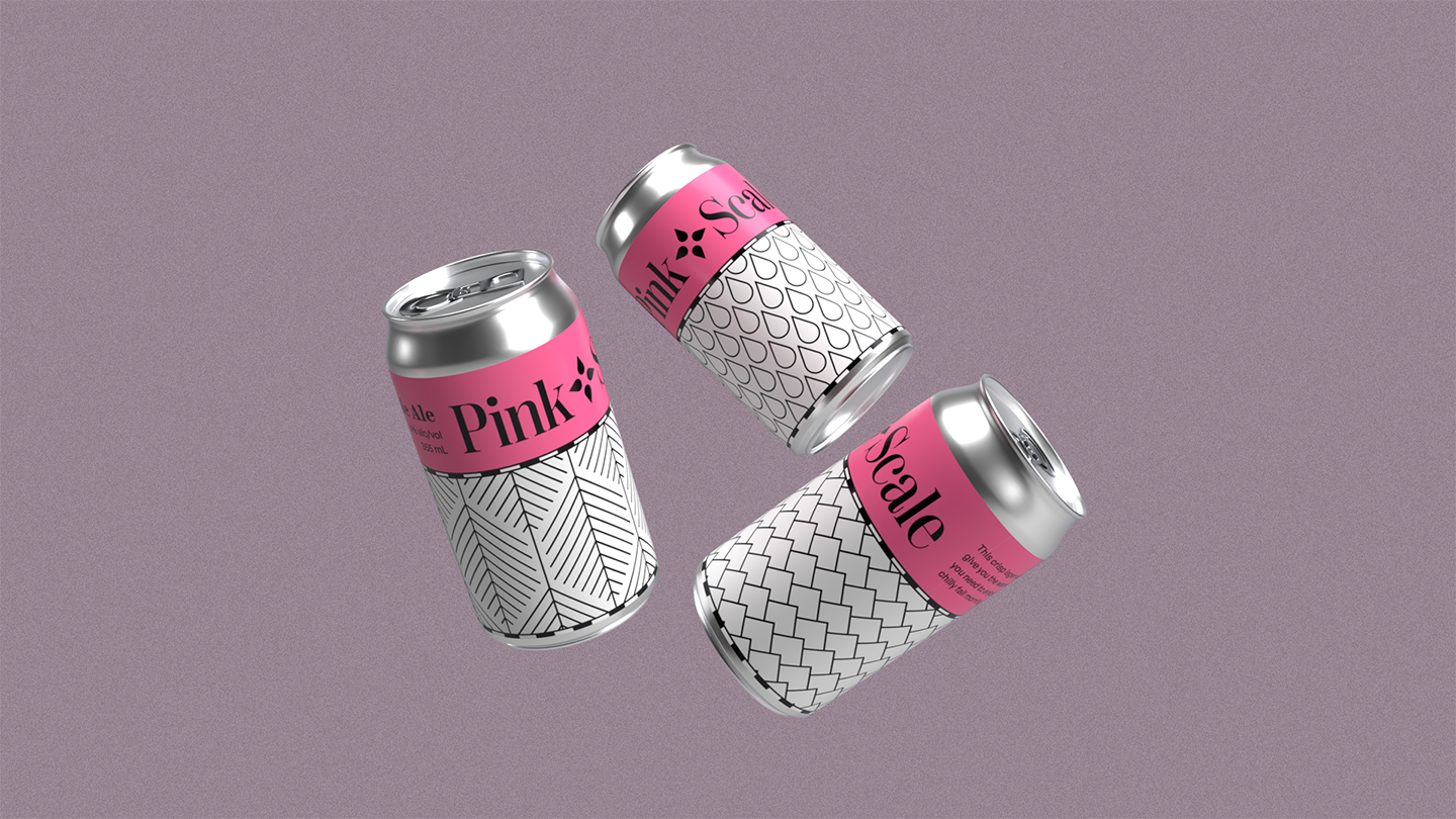
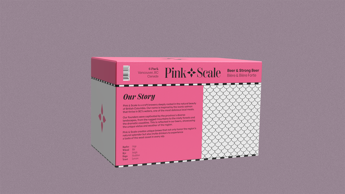
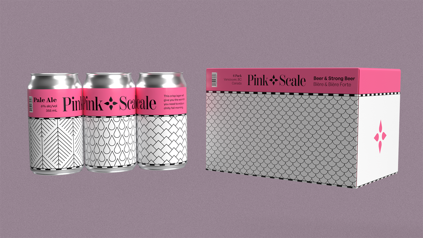
The packaging features local elements such as forests, mountains, and rain.

PACKAGING


SOLUTION
To have a solid visual identity, Pink & Scale will be represented primarily through the colour pink. A series of patterns will be used on all packaging and cans. These will be pulled from things that represent our region, such as mountains, forests, rain, and salmon. The black and white bar is inspired by the distance scales of maps. This is meant to tie into the idea of location, location, location. This combination of flat, yet bold elements will be instantly recognizable on liquor store shelves. The combination of simple and striking elements will grab the attention of anyone perusing the shelves and will be recalled easily by those already familiar.