Challenge
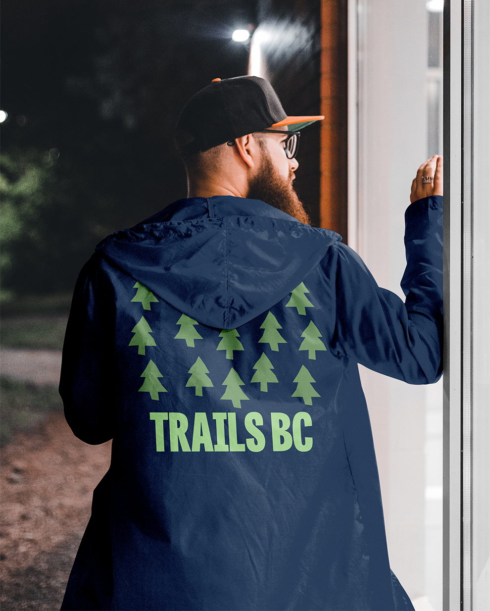
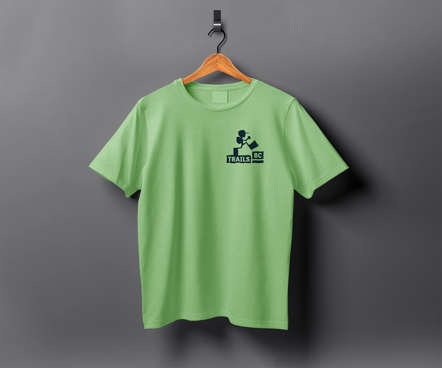
Trails BC is a charity focused on building and maintaining recreation trails in British Columbia. In this student project I gave them a full brand identity, including logo, illustrations, trail installations, and advertisements.


Strategy
The visuals will be eye-catching and informative, inspired by navigational signs with exaggerated proportions and rough edges. A blue and green color palette reflects BC’s forests, coasts, and sky. Bold typography will be used to grab attention, paired with simple instructions or calls to action (e.g., join or donate).
I chose this project because I love hiking. This project gave me the opportunity to apply my design skills to something that would make a positive impact on the world, as well as focus on illustration.

Solution
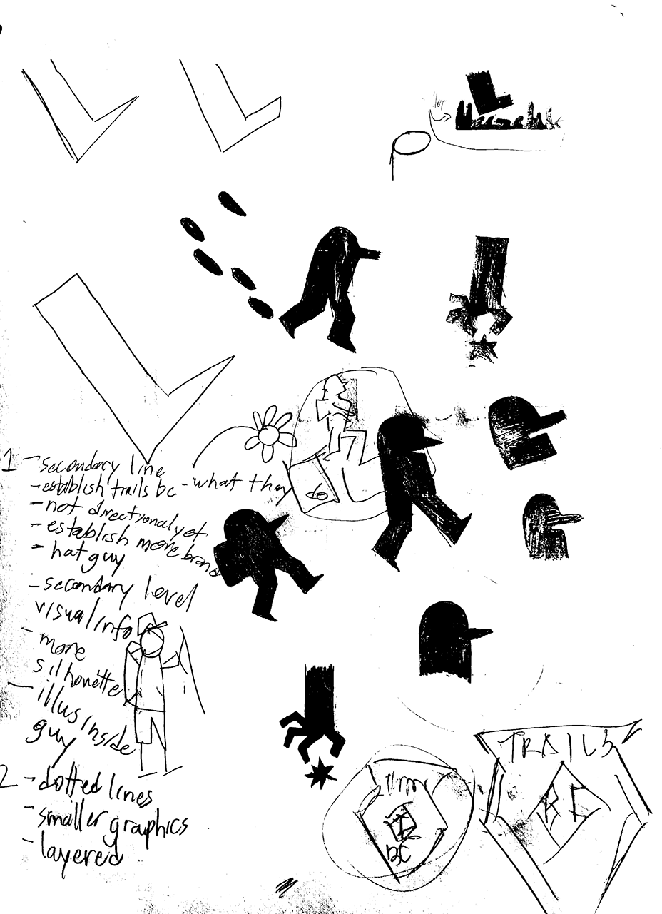
To increase brand awareness, Trails BC will use a primarily illustrative approach to their visuals. These chunky, blocky illustrations will help differentiate themselves from similar organizations, who use mostly photographic approaches. The visuals are meant to be both eye-catching and informative, taking inspiration from navigational signs, but with exaggerated proportions and roughened edges. The colour palette of blue and green represents the province of British Columbia, with our beautiful forests, coasts, and sky. Trails BC will also use photography where appropriate, with the subjects being nature and the people who use BC’s trails. The bold type will draw the audience’s eye, where they will be presented with simple instructions on how to properly use our trails, or a call to action, to join or donate to Trails BC. The brand identity will be applied across all channels: a new website, Instagram, and other social media accounts. Ads will be placed outside in high-traffic areas to get the most impressions.